Despite my parents’ best efforts to encourage my artistic side, I’ve never been very good at the more visual bit. My drawing style peaked at the age of 8. As such, I wasn’t entirely happy when I realised I would have to make a logo and icon for Poetic Places.
I understand the importance of branding and a good logo; the TIME/IMAGE logo—designed by artist and former colleague Harry Meadley— is easily recognisable and clear at any size. Size particularly matters in the case of Poetic Places, as it has to be identifiable when it’s the size of a small fingernail on your phone’s app menu. It can’t just be a logo, it also has to be an icon.
What might represent Poetic Places? A picturesque scene? No, because we’re including all kinds of landscapes and atmospheres. A modern, two-colour icon with a symbol or the word ‘poem’? Again, I wasn’t sure this would be representative of the content.

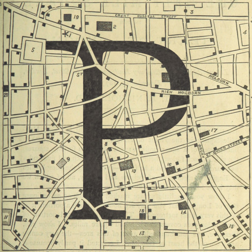
I turned to the British Library’s Flickr account for inspiration and soon came across a simple map of central London. I liked its simple lines, that we’re including poems in this area, and that it was conveniently square. I wondered if I could fit some lettering into the map—or even just a letter P, perhaps—so that it looked like one of the roads. I could, as it turned out.

However much I like this, though, it was no use as a mobile icon; the letter blends in too well and disappears, rendering the whole image an indistinct grey-beige square.
![One Half-mile Square in the Heart of London. (A [temperance] lecture delivered in Salisbury Hall.)](https://i0.wp.com/www.poeticplaces.uk/wp-content/uploads/2016/02/PP-logo-ios-1.jpg?resize=55%2C55)
Shading in the P was the obvious solution, and I liked leaving a few roads visible in front of it.

The resulting logo/icon may not be trendy or the peak of graphic design, but it is distinctive and ‘legible’ at smaller sizes. What’s more, I feel that it’s in keeping with the ideas and aesthetic of the app in general, particularly in that it reuses materials available under Creative Commons from the British Library collections.


